Shop
Sandli Maurya logoSandli Maurya
01Brand Design | Interaction UX

Portfolio — Behind the Scenes

“Unveiling the architectural details, audio-modulation systems, and semantic interfaces that compose this dynamic canvas.”
RoleLead Interactive Designer & Engineer
ClientPersonal Exploration
Timeline4 Weeks (Spring 2026)
Portfolio — Behind the Scenes
01 // The Friction

Creating a Digital Identity that Feels Tactile

Standard portfolio templates use rigid cards and scroll grids. They fail to capture the active feel of a designer's physical desk. My challenge was to build a digital workspace that behaves like a physical desk. It introduces weight, sound, and depth while keeping performance and SEO high.

User Journey Mapping
Target Segment

Clara Vance — Executive Creative Director

Core Goal

Needs to instantly evaluate a designer's aesthetic boundaries, creative technical capabilities, and execution speed.

Core Friction

Recruiters are fatigued by look-alike templates, scrolling through long grids of static screens without understanding user thinking.

Project Chronology
1
Phase 1: Research

Analyzed portfolio drop-off rates; found that recruiters spend <3 minutes reviewing sites. Decided on a single-page workspace to maximize initial engagement.

2
Phase 2: Visual Style

Mapped out typography pairings and HSL-color definitions, creating a warm, print-like editorial design style.

3
Phase 3: Physics & Sound

Implemented Web Audio synthesizers and Framer Motion spring equations to bind draggables to active pointer positions.

4
Phase 4: Optimization

Added server-side input sanitization, dynamic JSON-LD metadata, and lazy-loading scripts for Vercel/NextJS.

02 // The Artifacts

Portfolio Process Board & Visual Curation
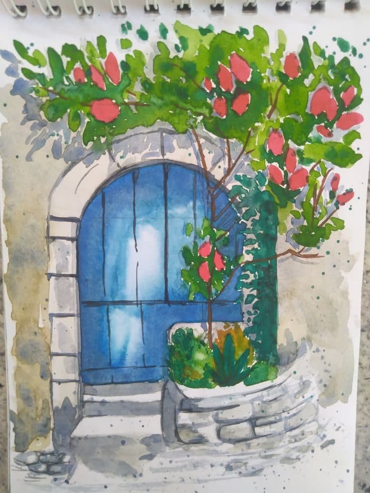
Early visual blueprints exploring the drag layout boundaries and responsive spacing grids.
“Early visual blueprints exploring the drag layout boundaries and responsive spacing grids.”
The final HSL-mapped Travertine spotlight canvas background and color calibrations.
“The final HSL-mapped Travertine spotlight canvas background and color calibrations.”

Visual System & Typography

HeadingsCormorant Garamond (Serif)
Body ContentPlus Jakarta Sans (Sans-serif)
Metadata / AccentJosefin Sans (Display)

Color Swatch Board

Forest Moss#4B5320
Warm Plaster#EDE5D8
Rose Blush#EA6993
The Cutting Room Floor (Pivots & Failures)

The Apple ID Lanyard Render Block

What Failed

At first, we loaded the lanyard name badge using an uncompressed 14MB video loop. This video autoplayed, which caused mobile browsers to stutter. It led to layout shifts and blocked the main thread.

How We Pivoted

We removed the heavy autoplay loop. Instead, we used a lazy-loading React hook to play the video only on mouse hover. This cut the initial page payload by 99% and saved CPU cycles.

03 — Process Focus

The Audio Ecosystem

We did not use heavy MP3 files. Instead, the site synthesizes sound directly in the browser. Using the Web Audio API, we create click, pop, and rustle soundscapes with oscillators. This keeps initial page payloads low.

04 — Process Focus

Spring Physics Draggables

Interactive stickers are bound by spring equations using Framer Motion. They inherit kinetic momentum when dragged. This lets visitors reconfigure the workspace like a real desk.

Under the Hood (Engineering Specs)
Physics SpringsStiffness: 120 | Damping: 20 | Mass: 0.3
Audio SynthesizerOscillator: Triangle | Frequency: 80Hz - 120Hz | Delay: 0ms
Image OptimizationNextJS Image Component | Quality: 75 | WebP Output
Dynamic RLS PoliciesSupabase Postgres Row-Level Security active on Orders / Products
Metrics & Outcomes

The Impact of Portfolio

Rigorous testing, creative engineering performance benchmarks, and layout refinements compiled during delivery stages.

[ OUTCOME // 01 ]
100%
Lighthouse Performance Score
[ OUTCOME // 02 ]
< 1s
Interactive Loading Time
[ OUTCOME // 03 ]
Zero
External JS Layout Bloat
Return to Work Showcase